01 — The Brief
From a printed album to a digital business.
Problem Statement
The portfolio was paper. The customer had to imagine. The furniture lived somewhere else.
One customer at a time, with no way to customize, preview, or shop the work. Three disconnected steps that kept the business small and the customer hesitant.
Objectives the app had to meet
01Digitize the portfolio
02Let customers experiment with color
03Generate room previews with AI
04Sell decor and furniture in-app
05Shorten decision time
02 — Research
I spent more time understanding the problem than designing the answer.
This was one of my first end-to-end projects, and I leaned into the process. Five methods, in sequence, before drawing a single screen.
A · User interviews
I ran open-ended interviews with prospective customers and practicing designers to understand how people actually look for interior design ideas, where they stall, and what they wish a tool would do for them. Six of the questions that opened the conversation:
Question 01
Can you describe your typical experience when looking for interior design inspiration or services?
Question 02
What challenges do you face when trying to plan or visualize a new design for your space?
Question 03
How do you currently explore and select interior design ideas, and what do you like or dislike about it?
Question 04
What features or tools would make it easier to experiment with different design options?
Question 05
How do you feel about using technology like apps or AI to help with interior design decisions?
Question 06
What would an ideal interior design app look like for you, and what key features would it have?
B · Key insights from observations
Across every interview, five patterns kept surfacing. Together they framed the rest of the work.
01
Fragmented design process
Inspiration is scattered across Pinterest, Instagram, and Google. Consolidating it is exhausting.
02
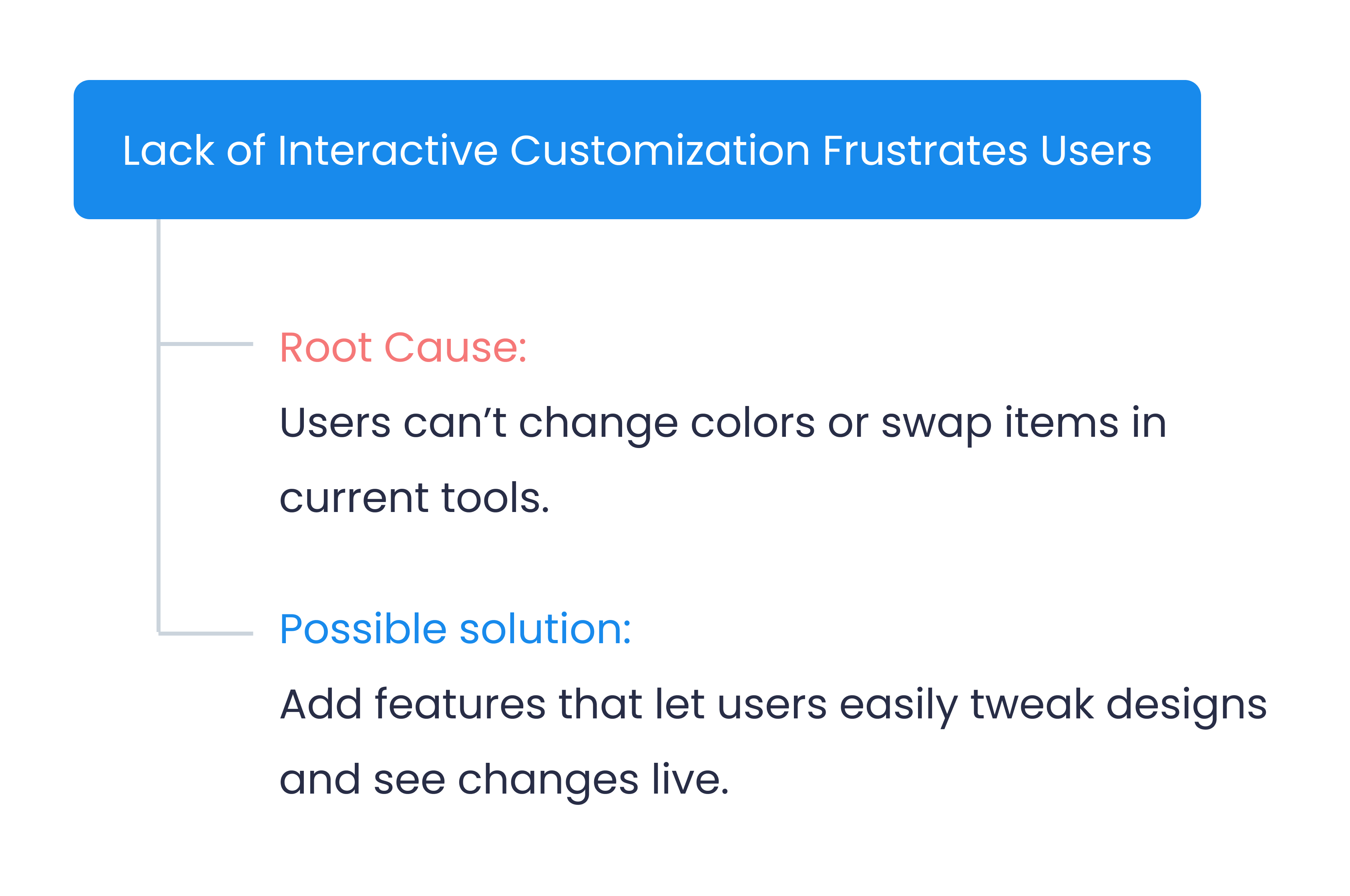
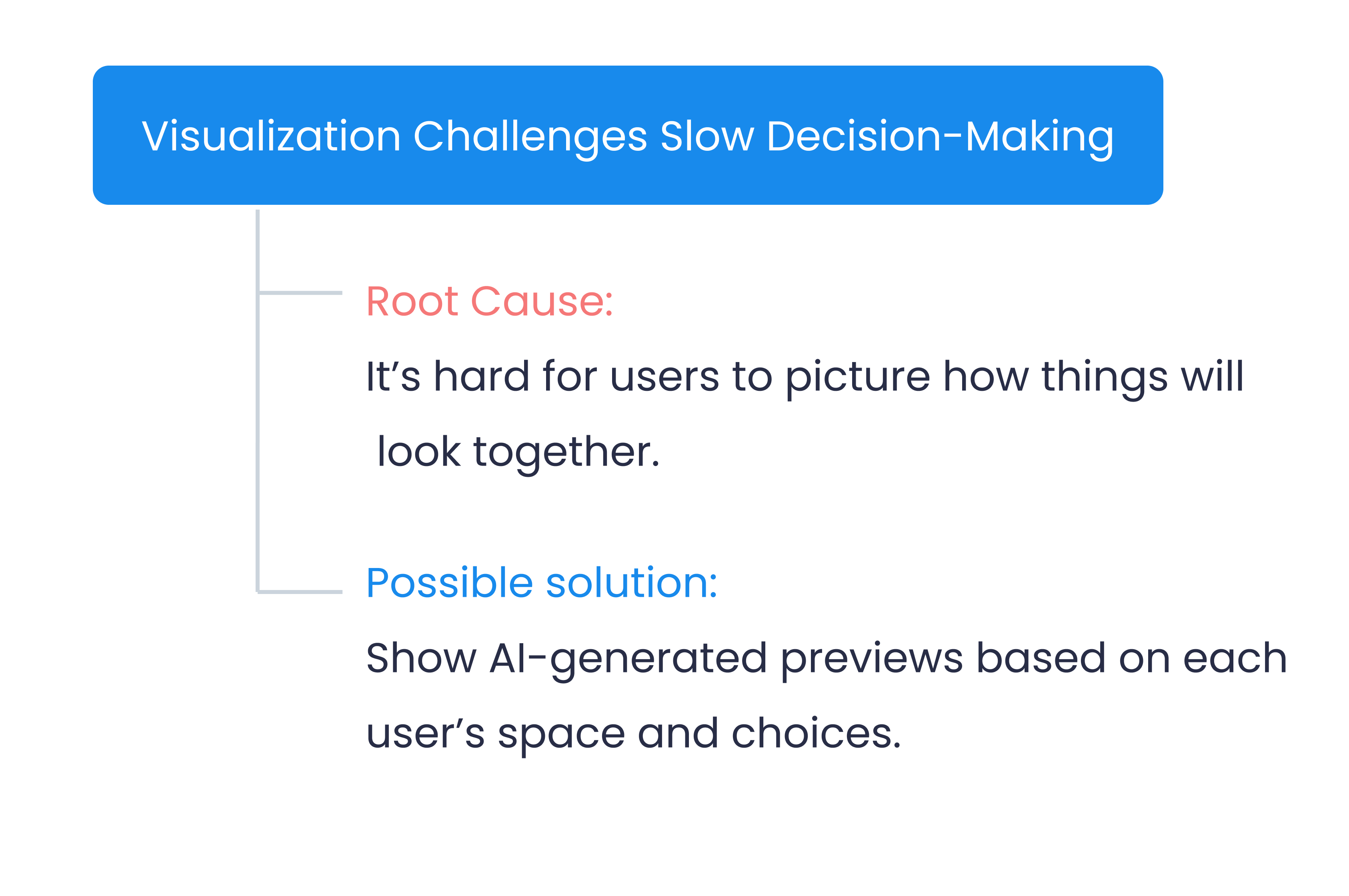
Visualization challenges
Customers can't picture how different interior elements combine into a cohesive setup in their own space.
03
Limited offline variety
Physical stores don't carry enough range to experiment with diverse styles before committing.
04
Appetite for AI customization
Strong interest in AI-driven suggestions and realistic previews of design combinations.
05
Need for professional input
Customers still want a real designer's validation at some point in the journey, not just an algorithm.
C · Two personas, two intents
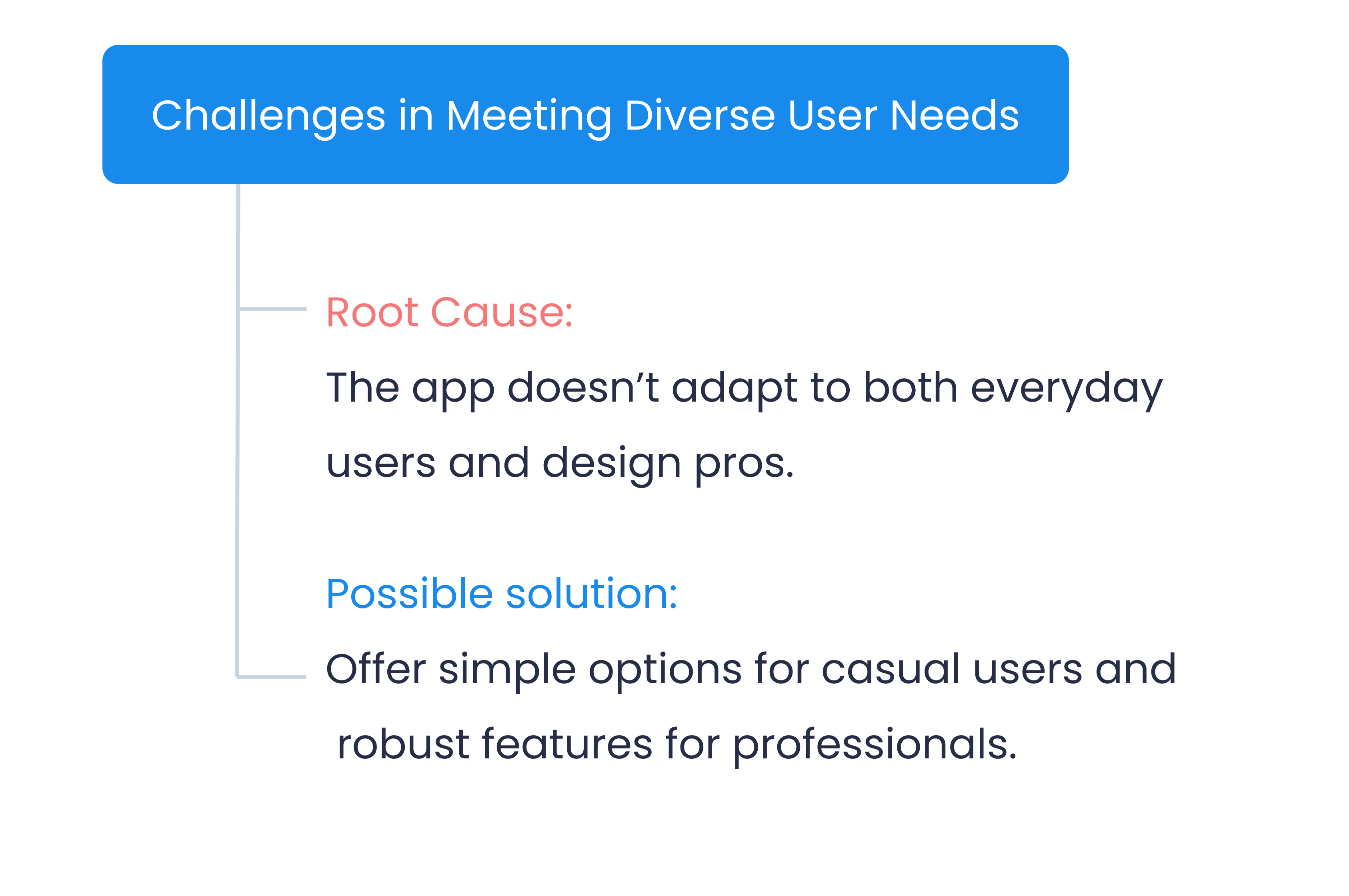
The interviews split cleanly into two intents. The everyday user trying to design her own home, and the professional trying to design many homes faster. The app had to serve both.
- Age
- 29 · Mumbai
- Background
- BBA, IT consultant
Tech-savvy
Detail-oriented
Loves aesthetics
Goal
Experiment with different decor styles for her new apartment without visiting multiple stores, and see real-time previews before buying.
Frustration
Inspiration is scattered. Existing apps are static and don't let her customize. She can't picture how pieces will look together in her own space.
- Age
- 32 · Hyderabad
- Background
- BTech, Real estate developer
Innovative
Curious
Values simplicity
Goal
Quickly browse and compare styles across property types, generate cost estimates, and present design options to potential buyers.
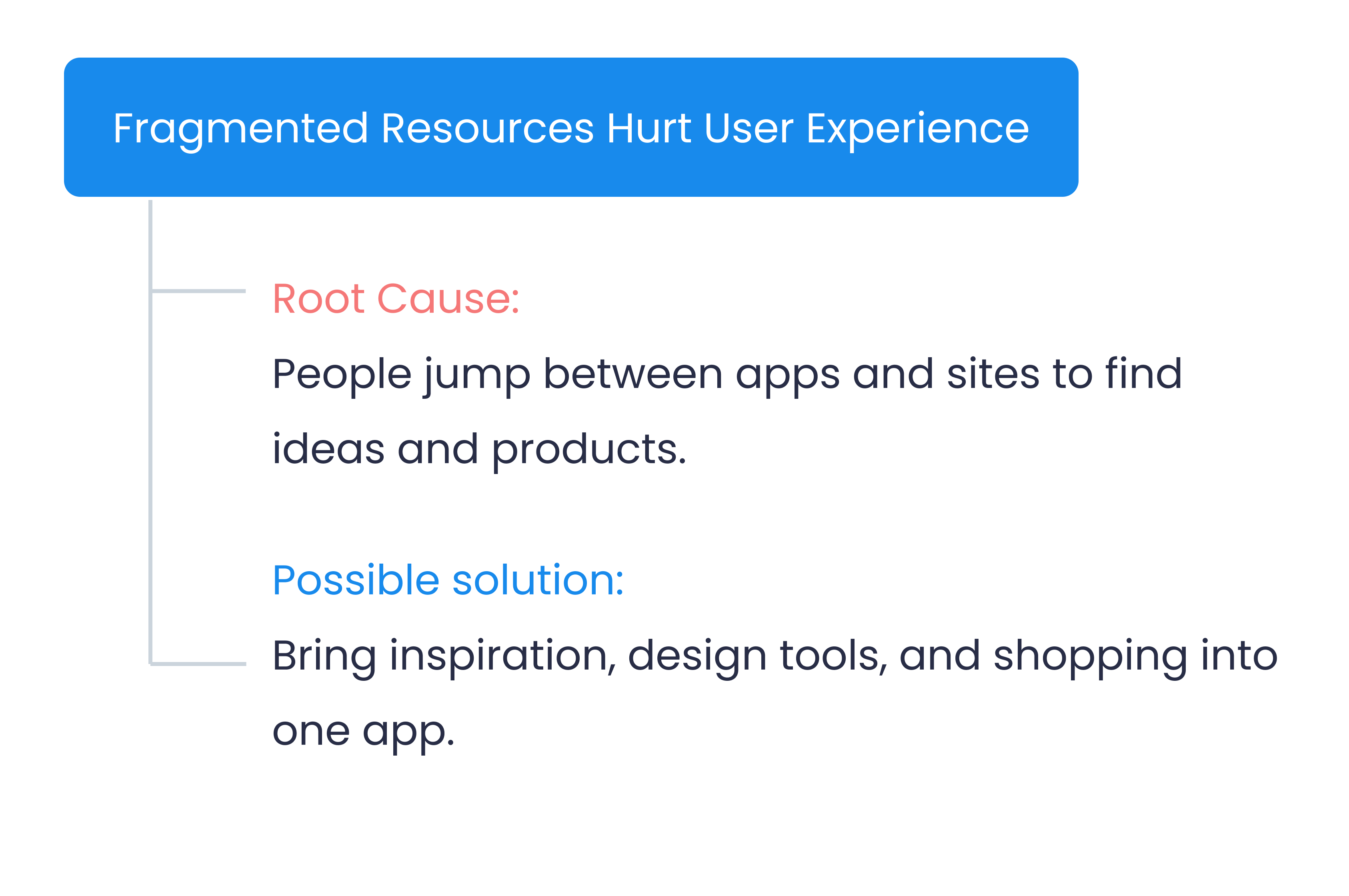
Frustration
Resources are scattered across catalogs and supplier sites. No tool combines inspiration, customization, and shopping in one place.
D · Empathy maps
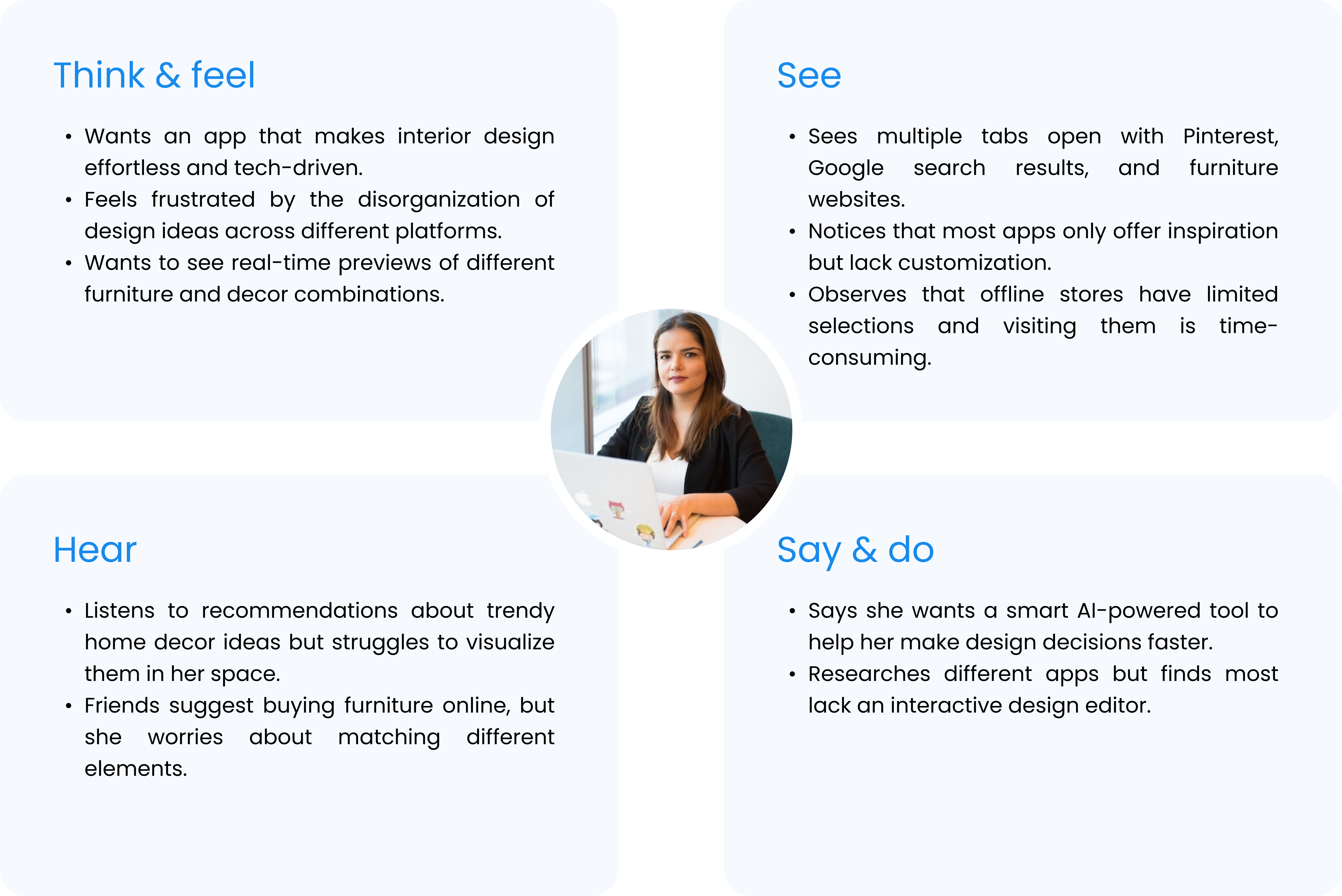
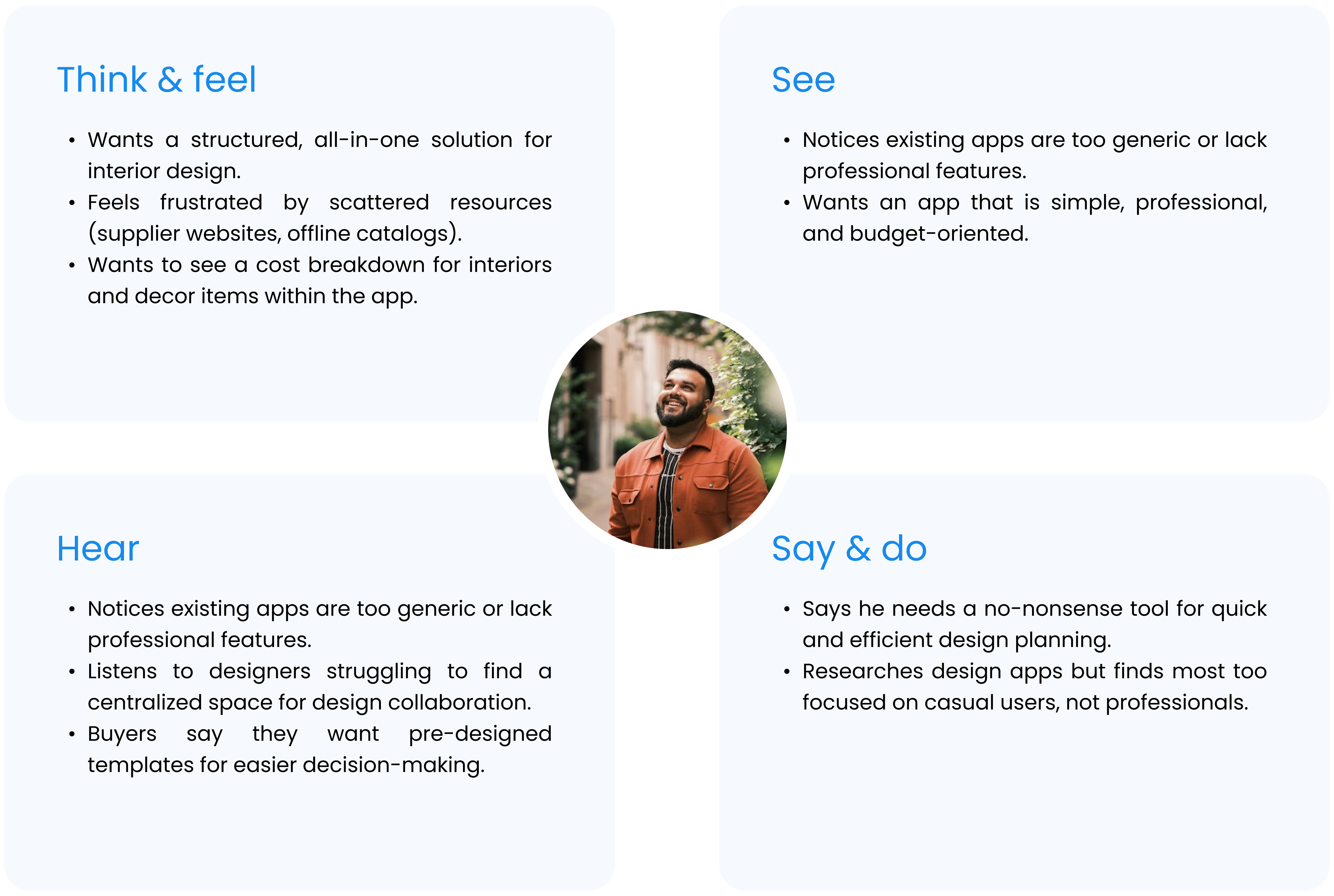
An empathy map for each persona, mapping what they think and feel, see, hear, and say and do. Side by side, they made the difference between the two intents obvious. It kept the design grounded in their own language, not mine.
Ananya · The everyday user
E · Root cause analysis
Every symptom from the interviews mapped to an underlying root cause and a candidate product response. RCA was the bridge between research and design.
Four symptoms surfaced, each tracing back to a different friction in the way people currently shop for and decide on interior design. Each one resolved into a clear direction for the product, so by the time I started drawing screens, every decision could trace back to a real cause.
The four causes set the priorities for the rest of the work: interactivity, visualization, integration, and serving two very different intents in one app.
03 — The Insight
Customers don't want more options. They want confidence in the one they pick.
The realization
Every root cause traced back to the same friction: too much to imagine, too little to actually see. Each extra step of imagination added doubt; each preview removed it.
The direction
The fix wasn't a bigger catalog or a smarter recommender. It was letting people see the outcome before they commit to it, across every job the app does.
04 — Three Flows
Three flows, one product.
The app does three jobs, each with its own user-task flow. They share a home page and a tab bar, but the work each one does is distinct, and each one removes a doubt the others would have inherited.
FLOW 01
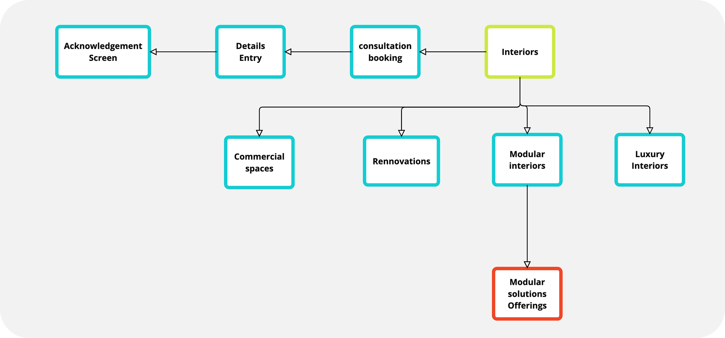
Interior flow
The designer's portfolio, browsable by project type and bookable for a consultation. The entry point for customers who want to see what's possible before they commit.
FLOW 02
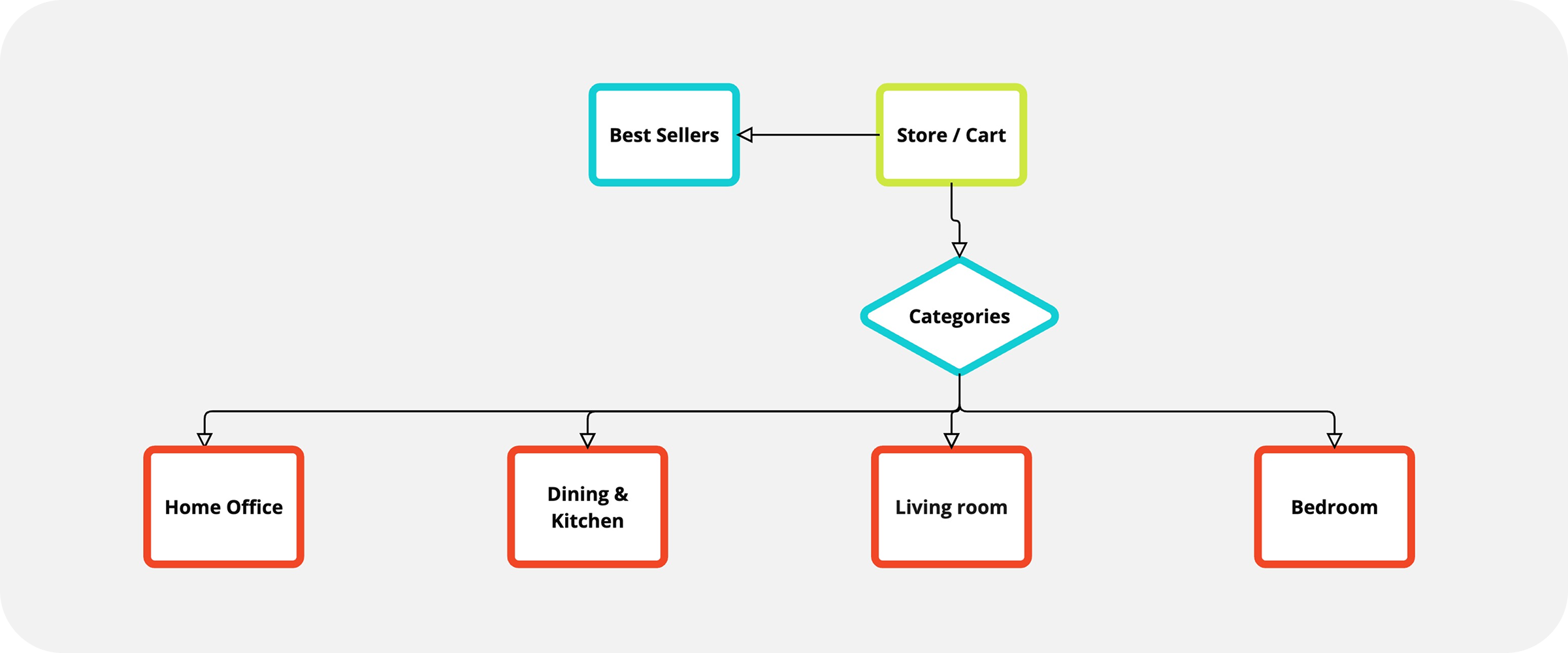
Store flow
The shop, organized for finding furniture by room or by what's selling. Where intent turns into a purchase, without needing to leave the app.
FLOW 03
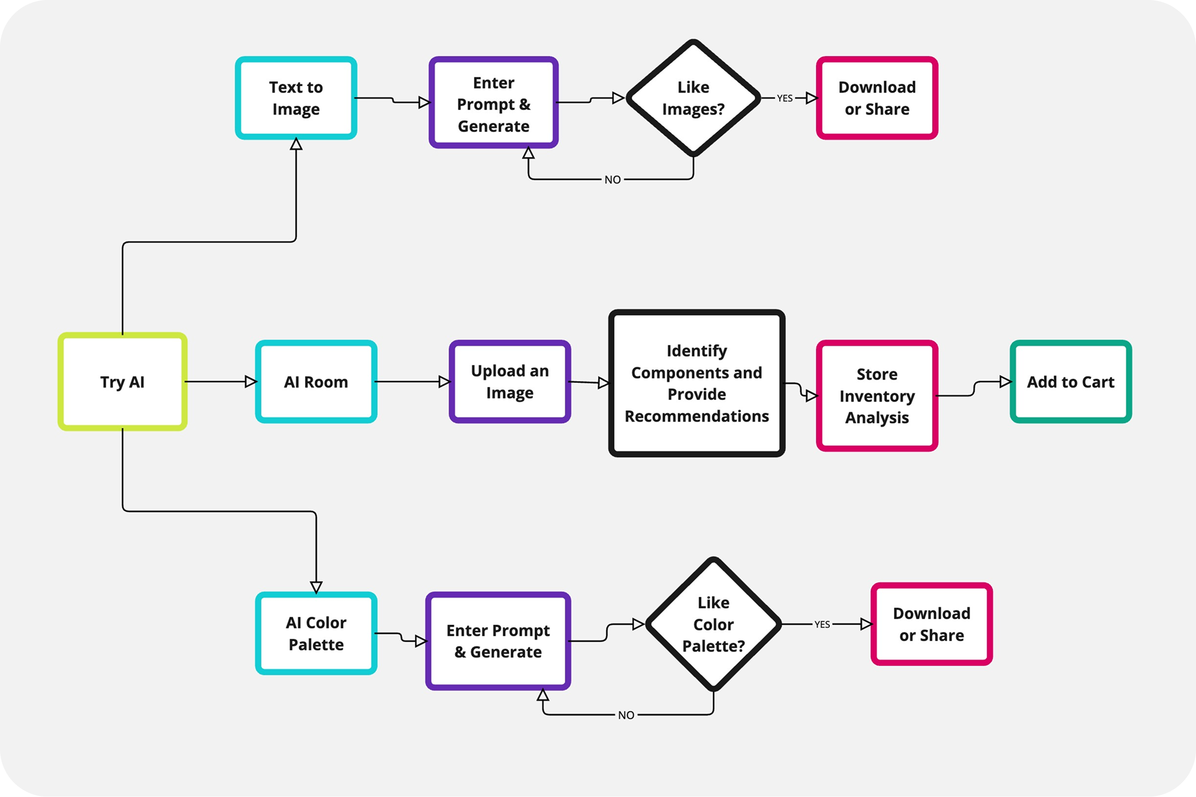
AI flow
The simulator that closes the loop between inspiration and purchase. Customers see their own room restyled, then add the pieces inside it to the cart.
05 — Architecture
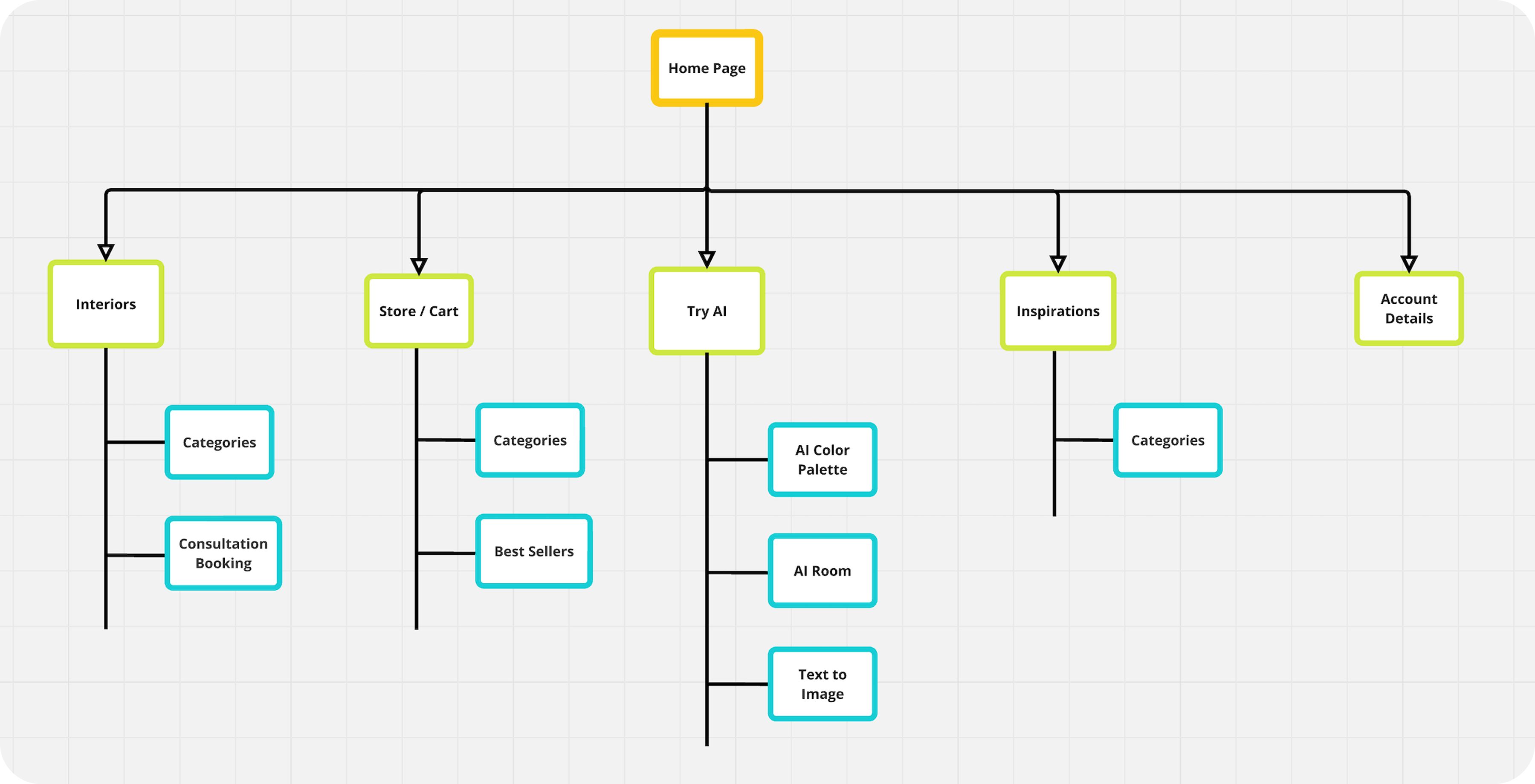
Three peers under one home.
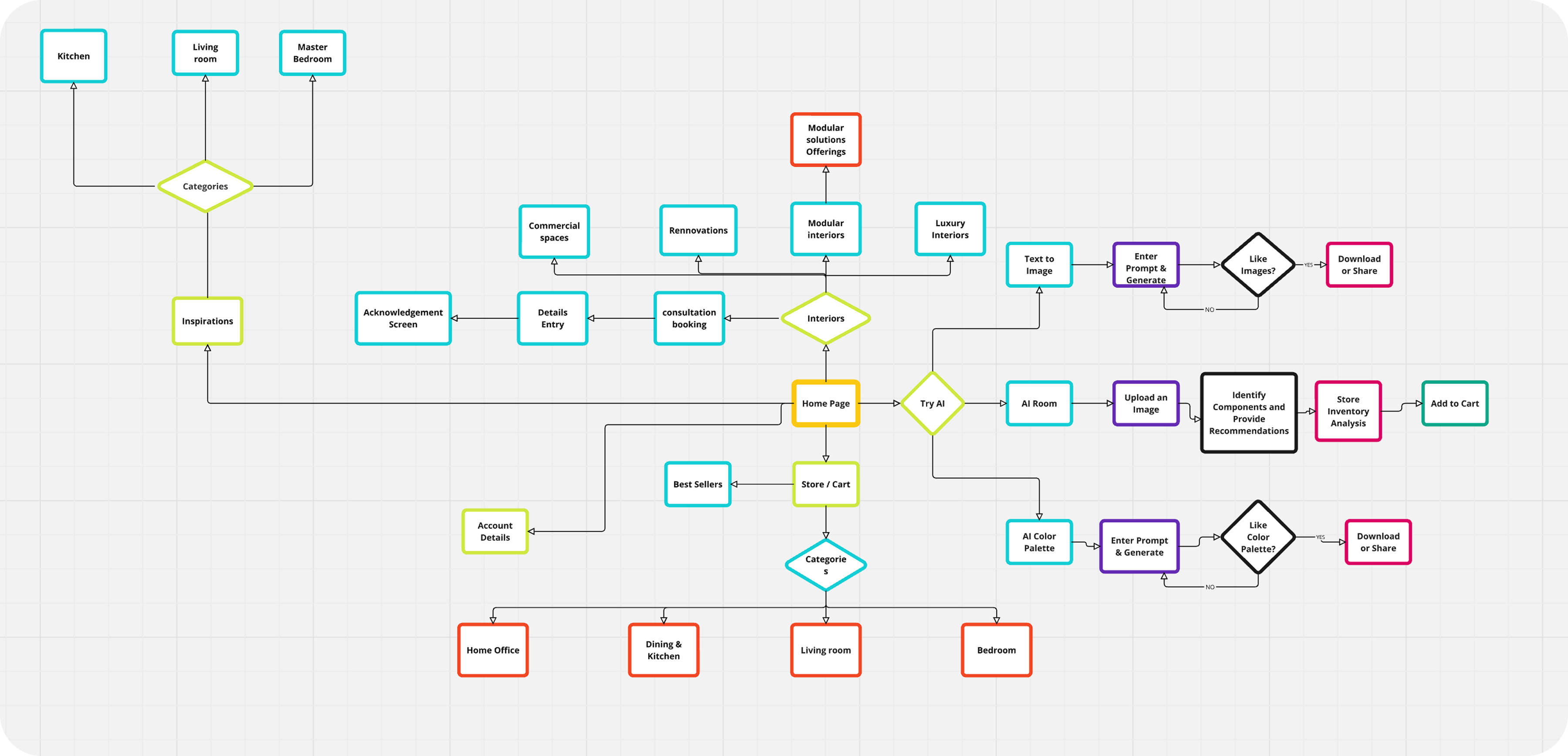
The IA treats Interior, Store, and AI as peers, not parents and children. Each hangs off the home page, each is reachable from any screen, and each carries its own sub-structure for the work that happens inside it.
Cross-links are explicit. AI-generated rooms expose their components as shoppable products, store items show the rooms they appear in, and portfolio pieces offer a "try this in my room" path into the AI flow.
The detailed architecture
The full map showing every screen, every sub-tree, and how the three flows cross-link inside the product.
07 — Impact
What changed once it shipped.
The product's job was to remove the imagining and shorten the path to a "yes." The post-launch numbers tracked exactly that.
Engagement
10×
Higher engagement than the previous portfolio-only experience.
Sales
₹10M+
Contributed sales growth tied to the integrated shop loop.
Capacity
3×
Client capacity per designer, freed by the digital portfolio.
Flow completion
94%
Of test users finished the core flow without hitting a dead end.
-
Tester 01
"I've been saving photos for a year and this is the first time I've actually seen what one would look like in my house."
-
Tester 02
"I'd buy the sofa now. Before this I'd have spent another month deciding."
-
Designer interviewee
"This is the first time I can show ten clients my work in one evening instead of one."
08 — What I'd Rework
One rule I'd hold the line on, looking back.
The Store flow used a different footer than the rest of the app. That's the call I'd flip today.
✕
Then
A separate footer for the Store flow.
Tuned to shopping actions. Felt contextual at the time.
✓
Now
A persistent tab bar across every flow.
Context lives inside the screen, not inside the chrome.
Why I'd hold the line
Persistent navigation
Same place, every time. Less working memory spent on wayfinding.
Consistency heuristic
The foundation of trust in any product.
Chrome vs content
Special actions belong on the screen, not in the nav.